Wedding Color Mistakes That Could Throw Off Your Theme…
Your wedding colors aren’t just pretty details, they’re the heartbeat of your celebration. From the flowers on your table to the bridesmaids’ dresses and even the cake, your wedding color palette sets the mood for your big day.
But here’s the catch: the wrong color choices can completely derail your theme. Imagine a rustic barn wedding decked out in neon pink and lime green, a woodland wedding overwhelmed with clashing shades, or a tropical beach ceremony weighed down by dark burgundy and navy. See the problem?
The good news is that avoiding these color pitfalls is easier than you think. In this post, we’ll explore the most common wedding color mistakes that could throw off your theme and share smart tips for picking your wedding color palette so you can create a look that feels cohesive, elegant, and authentically you.
Why Wedding Colors Matter
Wedding colors are far more than a simple aesthetic choice, they’re the thread that weaves together your theme, your venue, and your overall atmosphere. Colors create emotional cues. For example:
- Soft pastels evoke romance and serenity, perfect for romantic spring wedding colors.
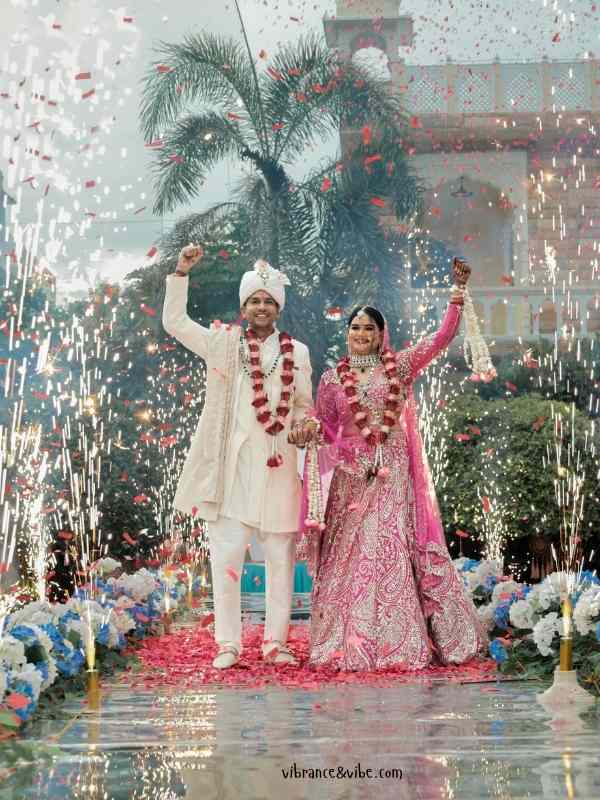
- Bold jewel tones bring drama and luxury, great when you want dramatic wedding color palettes.
- Earthy neutrals feel rustic and grounded, ideal for earthy wedding palette inspiration.
Think of your wedding like a canvas. Your colors are the paint, shaping the overall story you’re telling. Choosing the wrong hues (or too many of them) can distract from your vision and leave guests feeling like something’s “off” without even knowing why. This is where wedding color psychology and the science behind palettes, often called color theory, play a huge role.
Common Wedding Color Mistakes (and How to Fix Them)
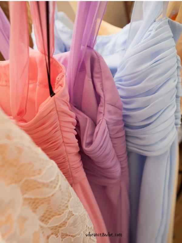
1: Choosing Too Many Colors
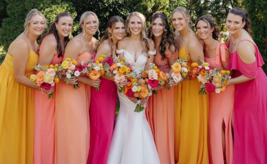
It’s tempting to want every shade of the rainbow at your wedding, especially when scrolling through Pinterest boards and some wedding moodboards. But cramming too many colors into one palette can make your decor look chaotic.
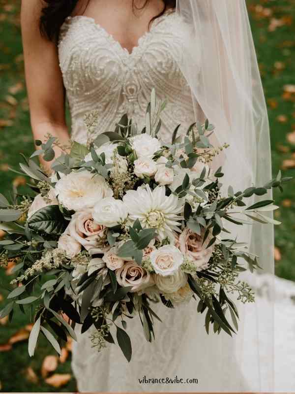
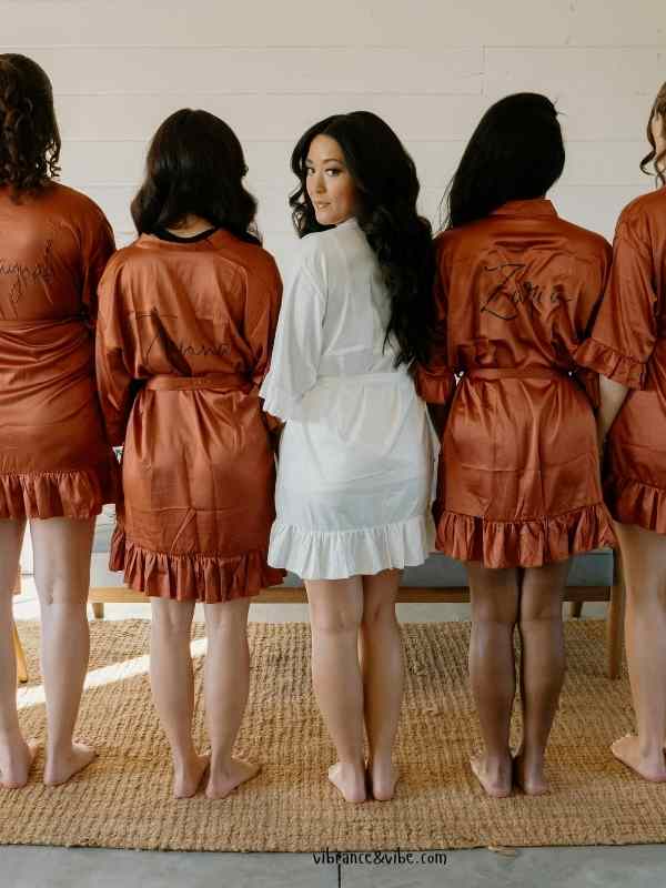
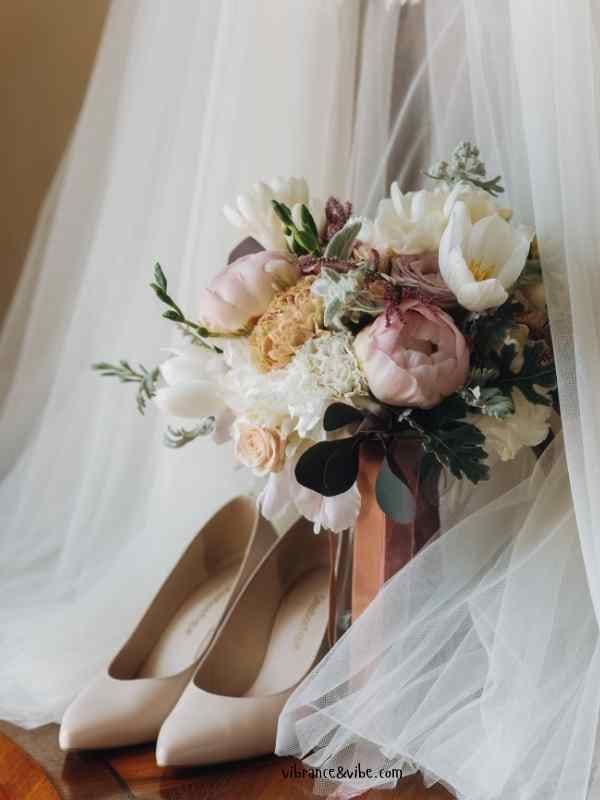
Fix it: Stick to two to four main shades, a base color, a complementary color, and one or two accent tones. For example, blush + sage + gold, or navy + dusty blue + ivory. This creates balance and gives you perfectly paired wedding colors instead of visual clutter.
2: Ignoring the Season
Colors that look gorgeous in spring might feel out of place in winter. Imagine coral and yellow in December or burgundy and forest green in July.
Fix it: Match your palette to seasonal wedding color palettes:
- Spring wedding colors: pastels, blush, lavender, mint.
- Summer wedding colors: coral, aqua, fuchsia, peach.
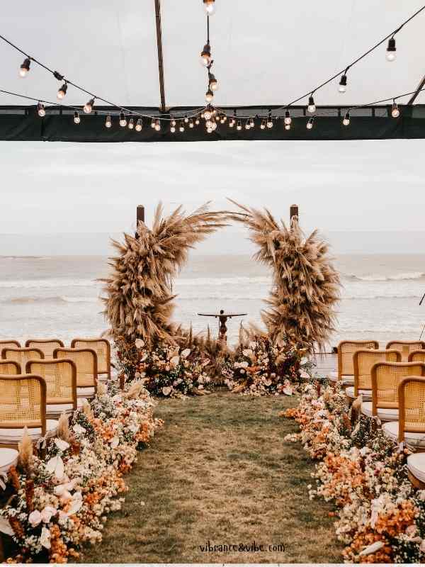
- Fall wedding palettes: burnt orange, mustard, burgundy, emerald.
- Best winter wedding color palettes: icy blue, silver, deep red, navy, gold.
Pro tip: If you love a “non-seasonal” shade, balance it with neutrals so it blends naturally. Seasonal alignment makes for timeless wedding colors that look intentional.
3: Clashing with the Venue
Your venue already has a color story, rustic wood beams, grand chandeliers, or crisp white walls. Ignoring this is one of the biggest wedding color matching tips.
Fix it: Study your venue’s tones before choosing. For example, a brick wedding color palette works beautifully in industrial lofts, while nature-inspired wedding colors (sage, ivory, clay) pair best with outdoor settings. Always ask: does this create color harmony in wedding design, or does it compete?
4: Following Trends Blindly
Trending wedding color schemes may look stunning now, but will they age well in photos? A fairytale wedding color palette trending today might feel dated years later. But your photos stay forever,
Fix it: Use trends for creative wedding palette inspiration, but filter them through your theme. For example, incorporate the Pantone Color of the Year subtly into details instead of forcing it into your main scheme.
5: Forgetting About Lighting
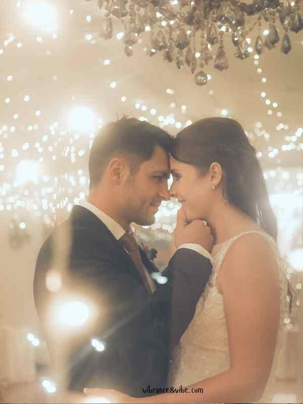
Lighting dramatically changes how colors appear. Emerald may look rich outdoors but nearly black in a ballroom.
Fix it: Test swatches and samples under different lighting. This step is part of any smart step-by-step wedding color selection guide.
6: Overlooking Cultural or Symbolic Meanings
Colors often hold symbolic meanings in different cultures. White may symbolize purity in Western weddings, but in some Asian traditions, it represents mourning.
Fix it: Respect traditions while still finding the perfect wedding color mixes for your theme.
If you or your partner come from cultural backgrounds with specific color symbolism, honor that when making your choices. This could mean avoiding certain shades or, alternatively, embracing traditional colors in creative, modern ways
7: Ignoring How Colors Photograph
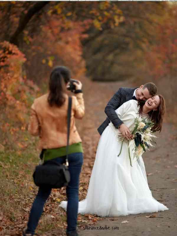
Some colors don’t translate well in pictures. Neon looks washed out, while metallics can over-reflect.
Fix it: Ask your photographer for wedding style color pairings that capture beautifully on camera. This is part of the bride’s step-by-step wedding roadmap toward a stress-free day.
8: Choosing Colors That Don’t Reflect You as a Couple
Your wedding colors should reflect your story. If you’re nature lovers, lean into rustic earth-tone wedding palettes. If you love city life, look at modern city wedding ideas and chic downtown wedding vibes for urban wedding color inspiration.
Fix it: Choose colors that feel authentic, whether it’s a raspberry and moss wedding palette, a wine and greenery wedding palette, or even a playful yet elegant wedding color combo.
How to Choose the Right Wedding Colors
Avoiding mistakes is one thing, but finding the perfect wedding color match is another. Here’s a roadmap:
- Start with your theme; romantic, rustic, modern, boho, or metropolitan wedding inspiration.
- Draw inspiration from your venue, flowers, or natural environment.
- Stick to 2–4 shades for balance (balancing wedding color palettes is key).
- Build fresh wedding color moodboards with tools like Pinterest or Canva.
- Test colors in real life, your best bet for discovering harmonious wedding palettes.
Expert Tips to Avoid Wedding Color Mistakes
- Consult professionals, they’ve seen powerful wedding palette ideas and know what works.
- Anchor with neutrals like ivory, champagne, and sage for classic wedding color schemes.
- Sync stationery, attire, and decor for curated wedding palette inspiration.
- Think big picture, this is straight out of the complete wedding planning handbook and aligns with essential wedding planning tips.
Your wedding colors are more than decoration, they’re the emotional heartbeat of your big day. Avoiding common blunders like overloading your palette, ignoring the season, or following fleeting trends ensures your wedding stays beautiful and authentic.
At the end of the day, remember that unique wedding colors chosen with care tell your story better than anything else. Wedding planning made simple starts with colors that feel true to you.
So take your time, explore inspiring wedding color schemes, and choose a palette that celebrates your love in the most vibrant, timeless way possible.
Now it’s your turn, what wedding colors are you leaning toward? Drop your favorite palettes or questions in the comments below!